
Replacing an entire legacy
application on a tight deadline
- Industry: Financial Services
- Challenge: Replace the organization's highly customized, and complex core business tool before the solution provider's product EOL deadline.
- My Role: UX Design, UI Design, User Test Facilitation, Feedback Analysis Facilitation
Overview
With a rapidly approaching deadline to replace a highly customized, core business tool set to be retired by their solution provider, the organization was able to find suitable replacements for all but one key component; their implementation module. This tool was used by their independent financial advisors to organize and make recommendations that made up a client's financial plan.
Being an important piece to the organization's relationship with their clients, it was determined the best way to insure all of the legacy system's customizations remained intact was to rebuild the module in-house. In addition to retaining functionality, there where also some long standing improvements to be included in the rebuild efforts as well. Most notable was the reduction of plan NIGOs (plans not in good order - errors, incomplete information, etc) that cost the organization substantial amounts of both time and money to solve.
Approach
Typically, the organization's development process mirrored more of a hand off, waterfall-esque workflow. However, given the timeframe, complexity of the solution, use of inside and outside resources, my team managed to sell leadership on a more collaborative design thinking approach. Many aspects of our design process drew inspiration from one of my favorite frameworks; Design Sprints. However, given the entire approach was new to the company, we decided to spread out the activities into individualized sessions instead of the usual dedication of an entire week.
Discovery
The organization's project usually kicked off with extensive requirements documentation by a business analyst, this time, resulting in a 100 plus page document. Though nicely put together, it was immediately clear there was going to be a massive amount of follow up questions needed. Additionally, the document also lacked user input, or research.
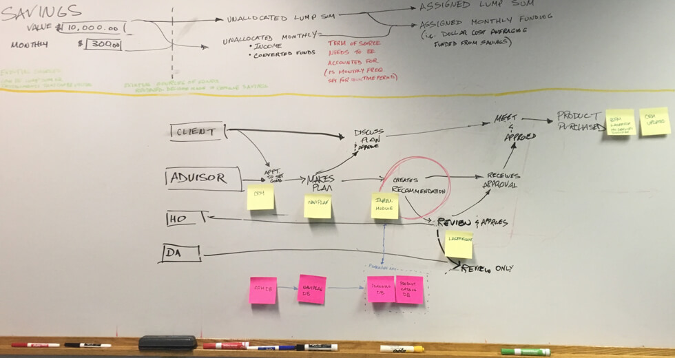
After reading through the documentation, we met with a solution architect to map out the entire process, gaining clarity not only on what our target was (circled area in photo below), but also alignment on where our tool's input data came from and where its output data was going.
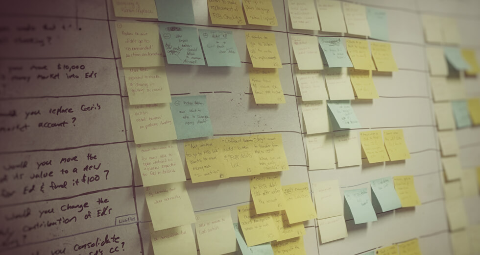
Next, I conducted several scenario mapping exercises with the business analyst and advisors to understand how the tool would be used on a day to day basis by its users. For most of the exercises, I used Mural directly and/or inputed whiteboard sessions afterwards. Which all made for easily accessible documentation to share with stakeholders in our progress reviews.
Prototyping
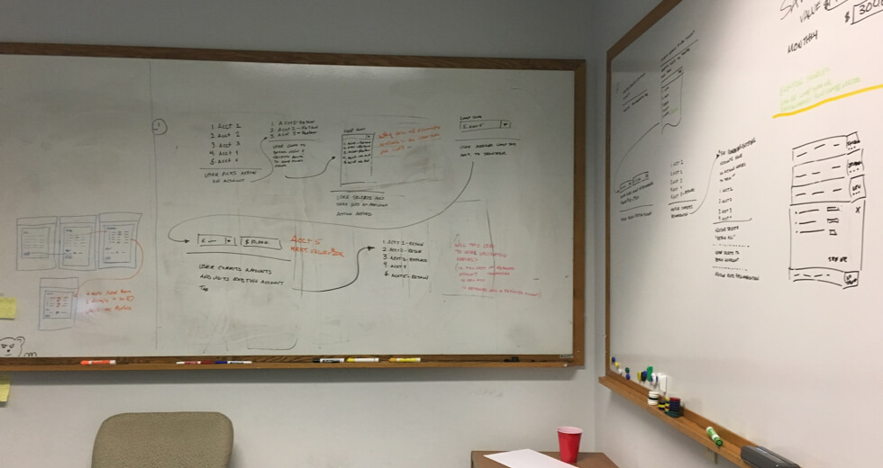
After mapping and framing the project, it was time to design the experience and UI. This was done primarily in three stages, starting with whiteboard sessions. Using all the input gathered, another designer and myself did a little co-design work focused on some of the more challenging elements of the overall solution.
Next, I took those whiteboard designs and created wireframes, often stitched together as a very LoFi clickable prototype. Which was shared with the business analyst and solution architect to make sure we were still on the right track.
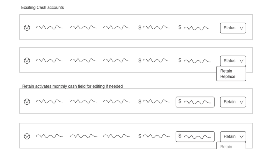
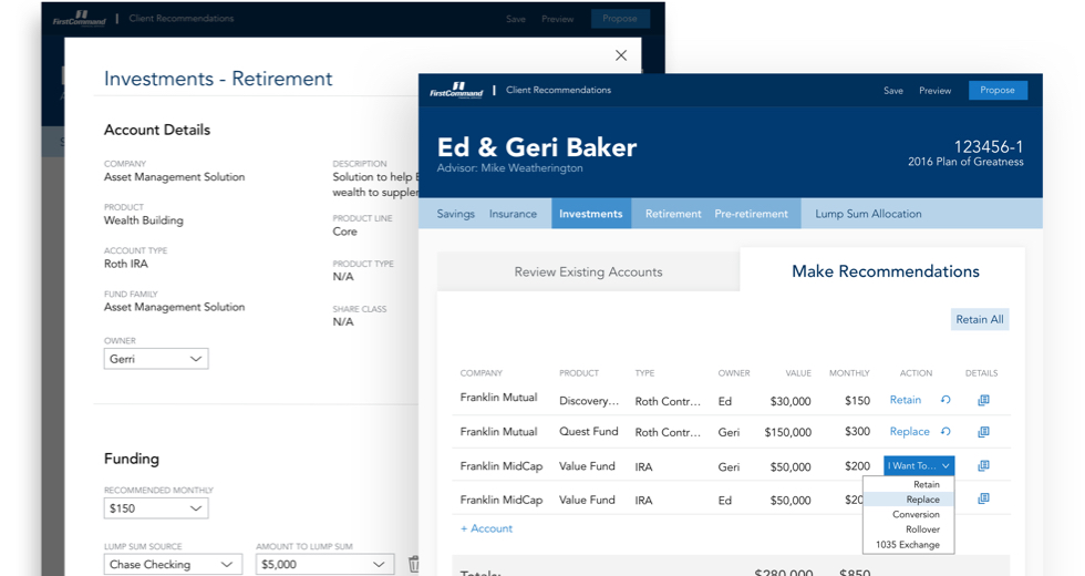
With business validation in hand, I then worked on designing out the entire UI, creating a more advanced clickable prototype to be used in our upcoming user testing. Adobe was our team's tool of choice, so I primarily used XD for the layout and prototyping while relying heavily on illustrator to create custom iconography.
Once everything was in a working state, we ran the designs through one more filter before conducting our user tests. Here myself and a few additional team members conducted a heuristics review, which was used to identify any areas needing additional focus.
User Testing
Our next step is one of my favorites. Time to get user validation. While this was completely abnormal process for the organization, leadership was really excited to see how this worked. Luckily, the application is advisor facing so we automatically had a very large pool to pull from. While our Field Associate Director recruited and scheduled our participates, I drafted the test script and documentation strategy.
My testing scripts where consistently organized and started with an intro basically explaining what the participates could expect and reiterate that we were testing the UI and not their abilities. This always seemed to help get more open and honest feedback. Next I further eased them into the test with some general warm-up questions before diving into the heart of the test.
The main goal for the user testing was to not only see if we designed a well organized UI but also if it met one of the key project goals; being self teaching. The design attempted to solve this requirement with progressive complexity and consistent elements. So, to test this, the structure of the main tasks mirrored this experience. The tasks started with a few simple and repetitive tasks, then progressively got more difficult as they moved on. After a pattern was established and the participates seemed to be navigating with ease, I'd throw in a curveball, breaking the pattern and forcing them to back track and/or troubleshoot.
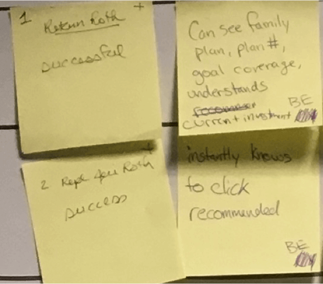
Each test was done via zoom so we where able to watch and record their movements through the app along with their feedback as they worked through the tasks. I also had 4 to 5 observers in the room to take notes and document the feedback. To make analysis afterwards easier, I unified the feedback by having them jot their notes on stickies, placing the task number in the left hand corner, +/- in the top right corner for a positive or negative statement, feedback notes in the center and observer's initials in the bottom corner (in case we need further clarification later).
Analysis
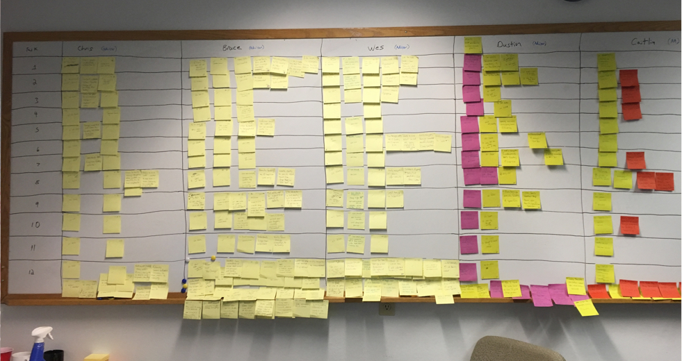
After all the participates had been interviewed, I placed the recordings on a shared drive for reference when needed and began preparing for our feedback analysis and affinity mapping session. My first step was to setup a whiteboard to display all of the observer notes. This was organized in a grid with participates names across the top and the tasks along the left side. Then all of the notes where placed in the appropriate square. This turned out to be a fairly quick task due to having all the notes structured the same. All were gathered and placed in a plastic sandwich bag after each interview and since they where numbered, placing them in proper squares was a quick exercise.
With all of the post-it notes in their proper place, another designer and myself when through the entire grid removing any duplicate comments. Having the observer's initials listed on the note was really helpful here because there where a few times we needed clarification determining if it was similar to another.
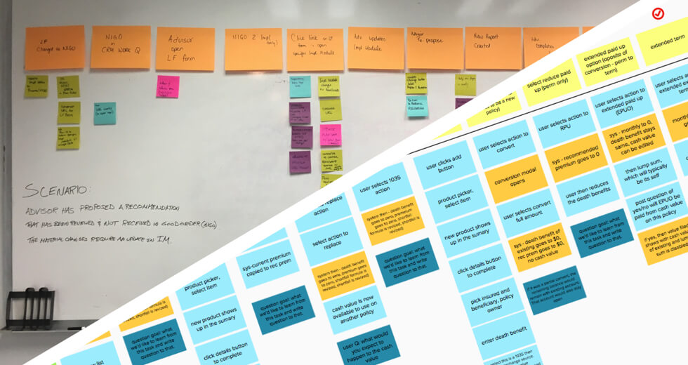
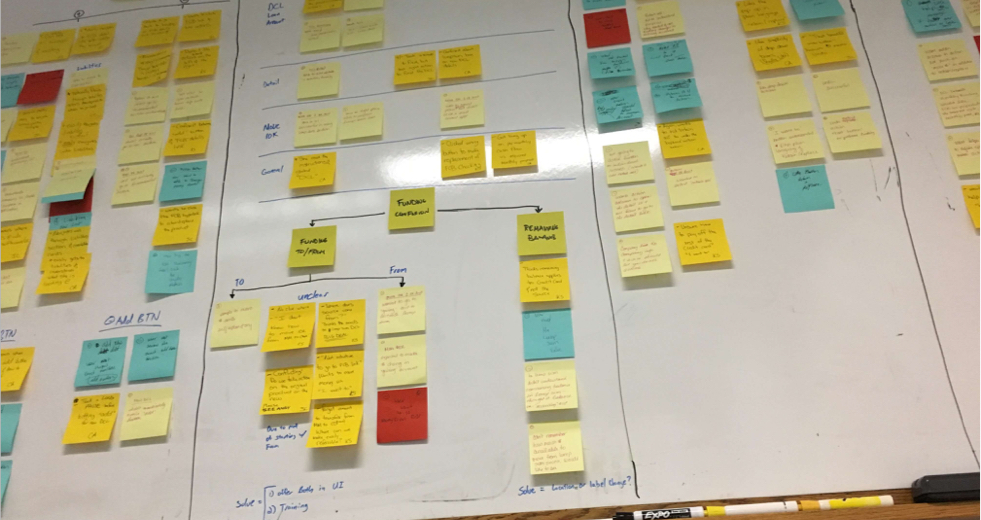
Once the board was clean and organized, we conducted affinity mapping sessions with the business analyst, user test observers and other team members looking for trends and patterns. These where then used to influence our design decisions on future iterations.
Conclusion
The process of prototype, user testing and analysis cycled through several iterations and different sections of the new recommendation tool. With each iteration, our user tests (comprised of different people each time) got faster and faster. Meaning the UI was getting better and quicker to pick up. Some of the best moments came as even first time advisor admins, with no financial familiarity or training, were able to complete fairly complex tasks rather easily.
I think outside of the successful user tests, advisor and leadership praise, one of my favorite outcomes of this project was to see other teams starting to incorporate the methods and activities used throughout this project. I'll never forget walking into a meeting room on another floor and seeing another team's scenario mapping session still spread-out all over the room.
We not only built a great replacement to a key legacy business tool, but also introduced the organization to the benefits of a collaborative, user centric, design thinking approach to solving big issues.

About Me
I‘m a Fort Worth based Product/UX Designer with ten years experience conceptualizing and crafting digital products.
Through that time, no matter the project, I’ve found that there are two constants that determine a successful project; collaboration and user input. If not directly, then indirectly through a multitude of project “hacks” that can achieve the same results. As long as all involved are iterating towards the same goal, and said goal is beneficial for the person actually using it, your project will be amazing.
Currently, I’m on the e-commerce team at Pier 1 working to strategically solve business objectives while also creating ideal experiences for our customers.
Previously, I was at First Command Financial Planning firm and a freelance contractor before that. At both stops I served in a designer role, facilitating concepts, prototyping, and crafting beautifully functional UIs with a little bit of html/css work thrown in good measure.